What's live vs. what it should look like.
Every screen below, laid out the same way: what's on the kiosk right now, a quick sketch marking the fix, and the Figma design at the proportions it should actually run at.
Three things that apply across all of the screens below
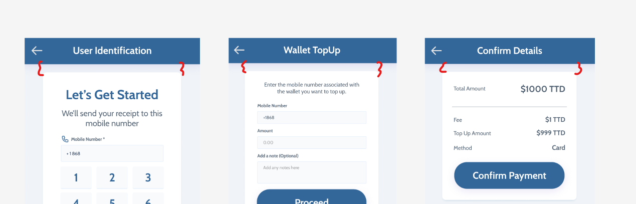
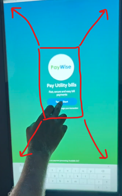
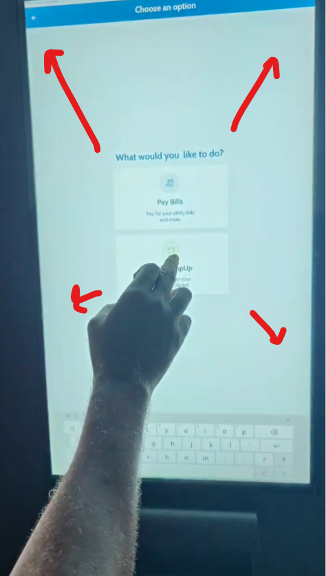
Align content to the top, under the header
On most screens the content card sits vertically centered, floating in open space. We'd like to move it up so it sits right under the header instead — same distance from the top, every screen — the way it's marked here on three of them.
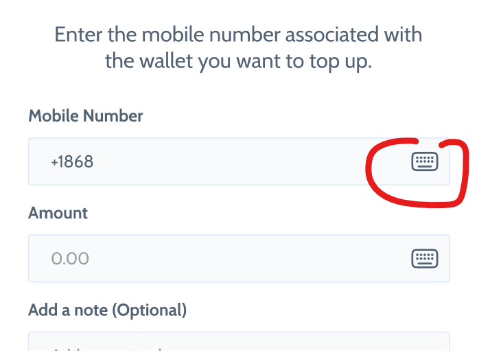
A keyboard-trigger icon inside each input
We'd like a small icon inside every text field — tap it to bring up the keyboard, instead of the keyboard being open by default.
Can this be done?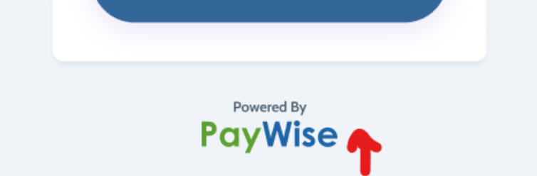
Give the PayWise logo room above the keyboard
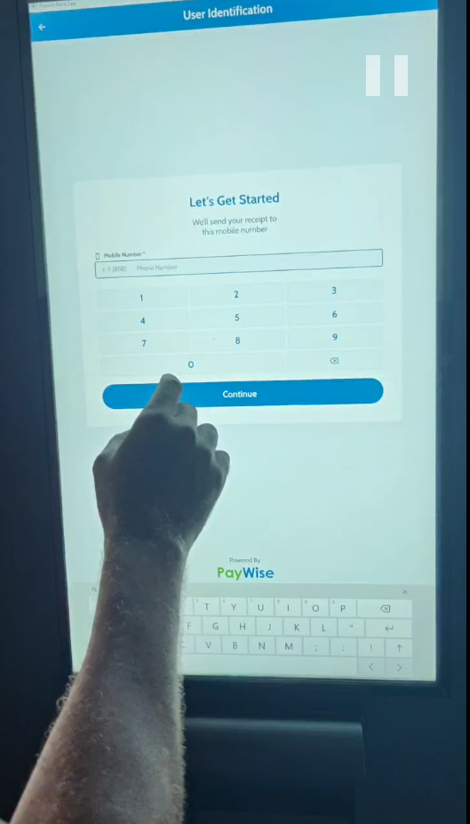
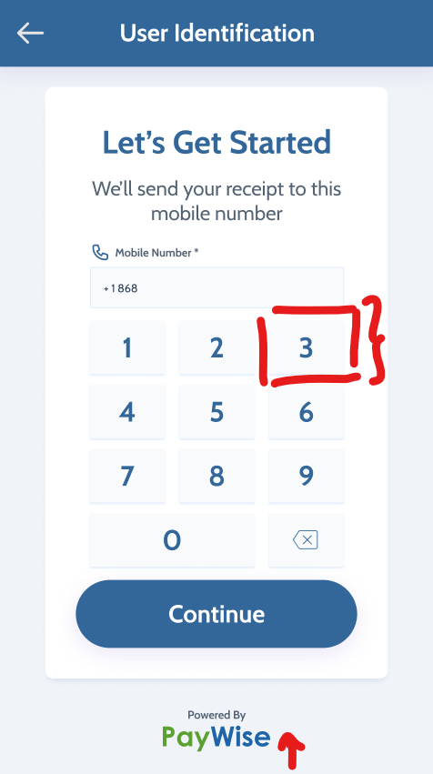
On screens where "Powered by PayWise" sits right above the keyboard, push it up roughly 1cm so there's breathing room — marked with the arrow here.
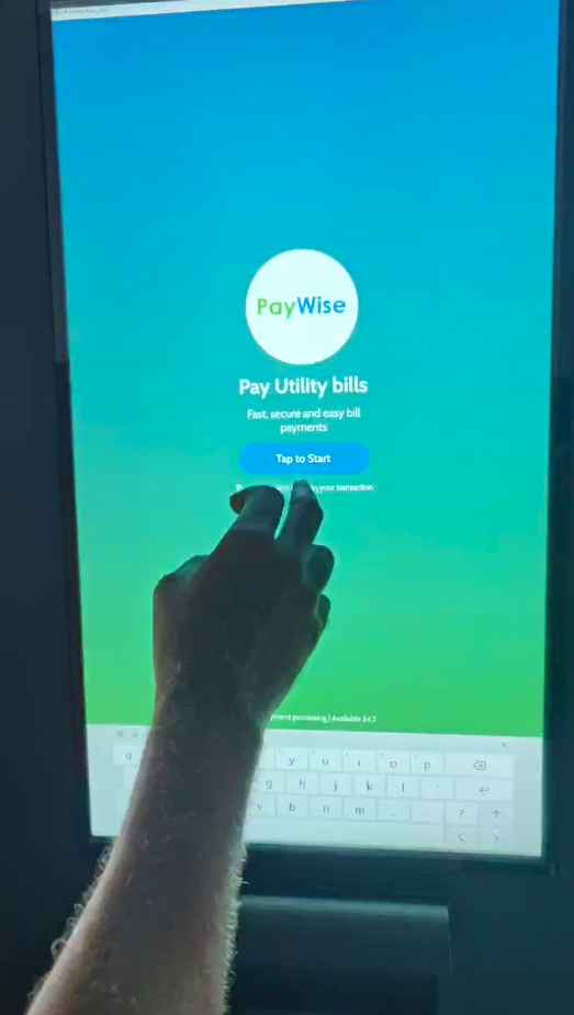
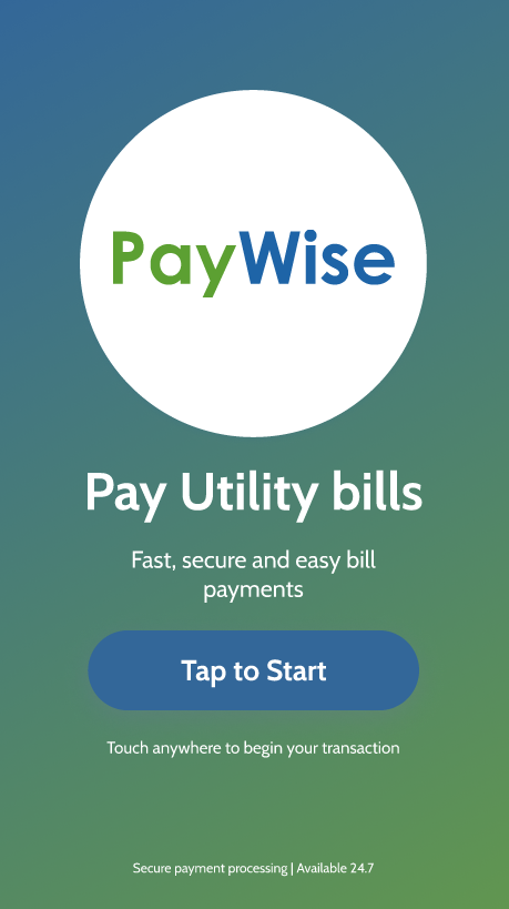
Welcome — "Pay Utility bills"
Content sits in the top third of the screen with a lot of unused space below it — and the keyboard is open even though there's nothing to type on this screen at all.
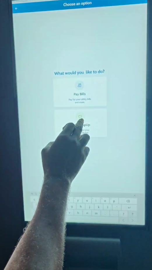
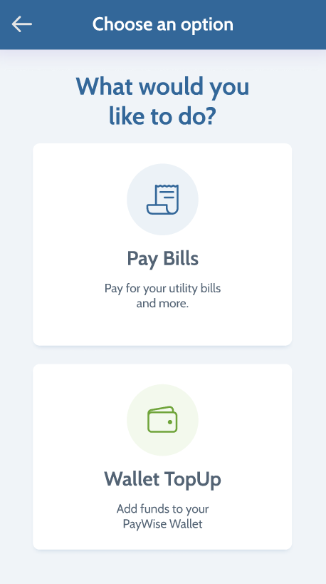
Choose an option
The two option cards should run close to the full height of the screen, like the design — not stay boxed into the top half.
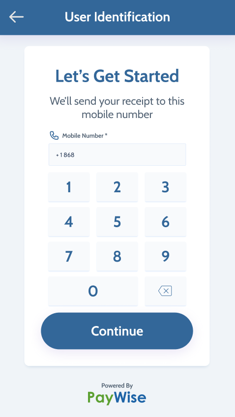
User Identification — phone number
Same proportion issue, plus the logo-spacing note above — the number keys and card should fill more of the card, and "Powered by PayWise" needs room above the keyboard.
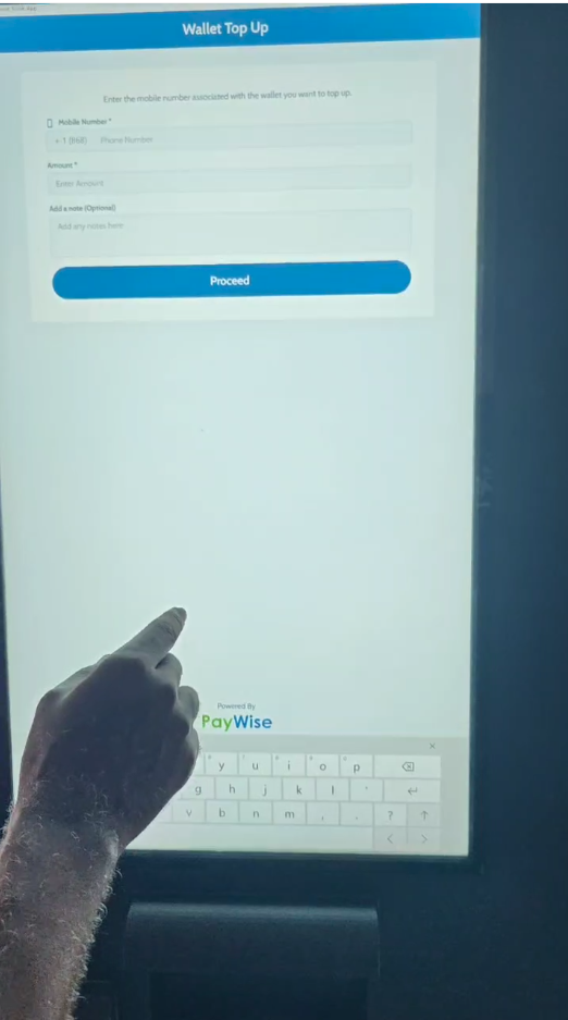
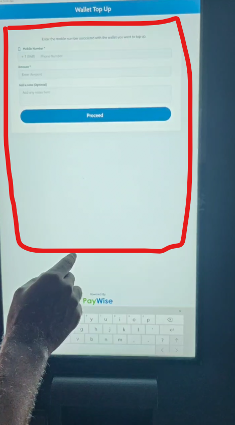
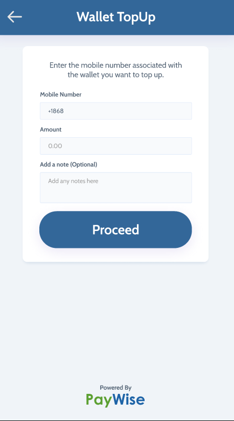
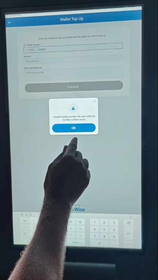
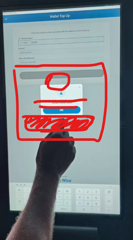
Wallet Top Up — amount entry
Card floats mid-screen with a large empty area below it before the keyboard.
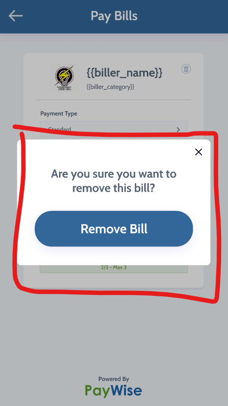
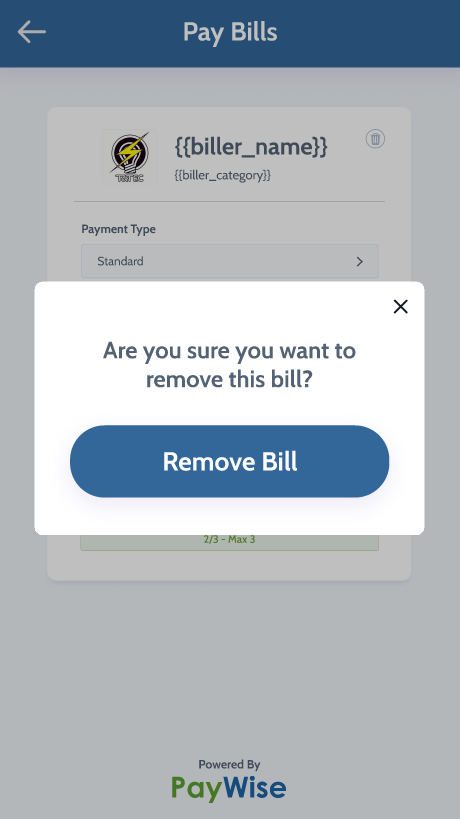
Pay Bills — remove-bill confirmation
The page behind the modal, and the modal itself, are compressed into a tight band near the top of the screen. Two sketches showing approximately how much space the modal should occupy.
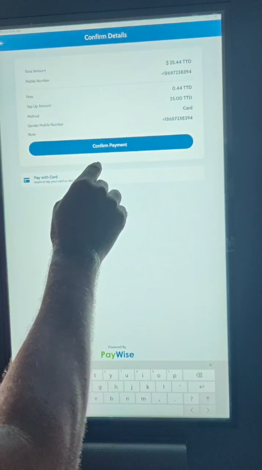
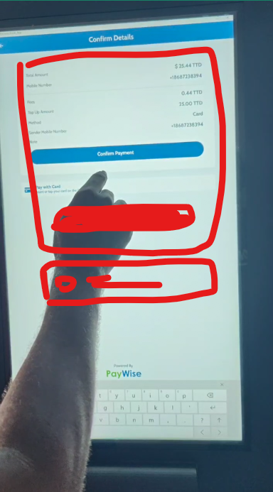
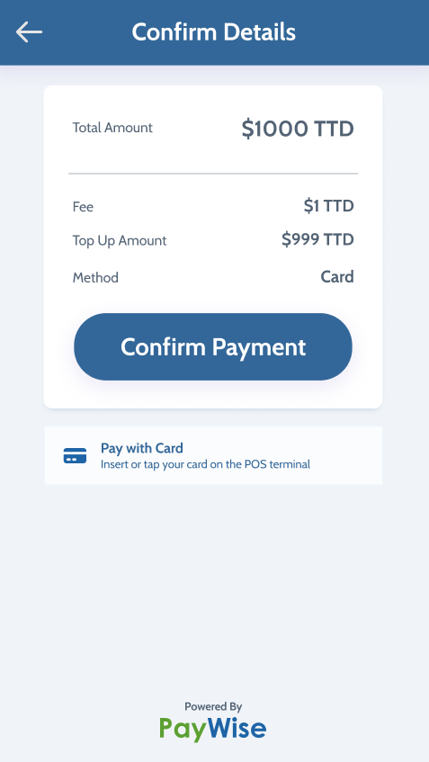
Confirm Details
Totals and the "Pay with card" block are cramped near the top with no breathing room underneath.
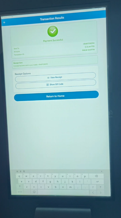
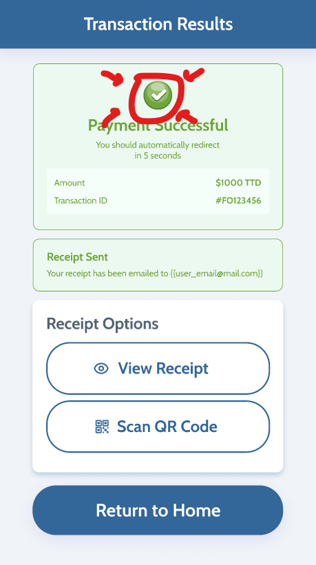
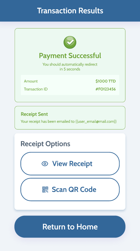
Transaction Results
I made the check icon smaller to allow more space for the buttons to fit in the screen.
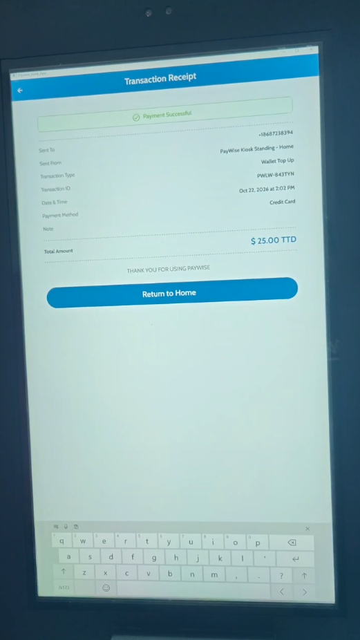
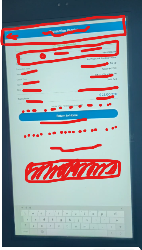
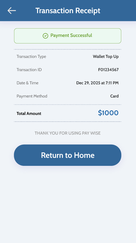
Transaction Receipt
Same idea as the rest — the receipt should occupy the screen the way it does in the design, not sit as a small block at the top.