Proportion
audit.
Six concrete gaps between the PayWise Kiosk design and what's running on the floor right now — screenshotted, measured, and ready to hand to the developer who built the interface.
- 01Layout isn't scaled to the kiosk's screenRoot cause
- 02"Choose an option" cards cramped into the top halfScreen
- 03Email step missing its keyboard-trigger iconScreen
- 04Keyboard shows with nothing to typeBehavior
- 05PayWise logo needs room above the keyboardSpacing
- 06Add a ring around the map pointerSeparate screen
Layout isn't scaled to the kiosk's screen
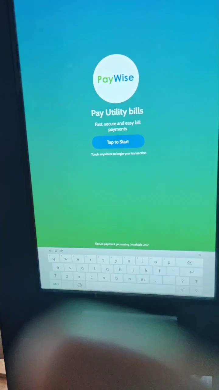
The design was built on a 1080 × 1920 canvas. Right now the build looks like it's placing every element at that same literal size, on whatever resolution the kiosk screen actually is — so content keeps its design-time size and sits pinned near the top, instead of growing to fill the frame the way it does in Figma. Below is the kiosk's own welcome screen: the logo, headline and button all cluster in the top 39% of the display, and the rest is dead space.
"Choose an option" cards are cramped into the top half
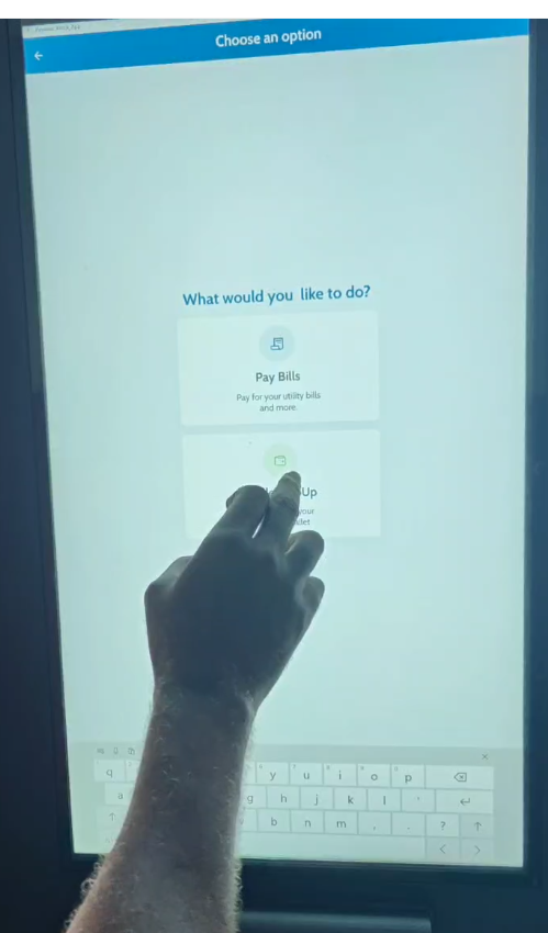
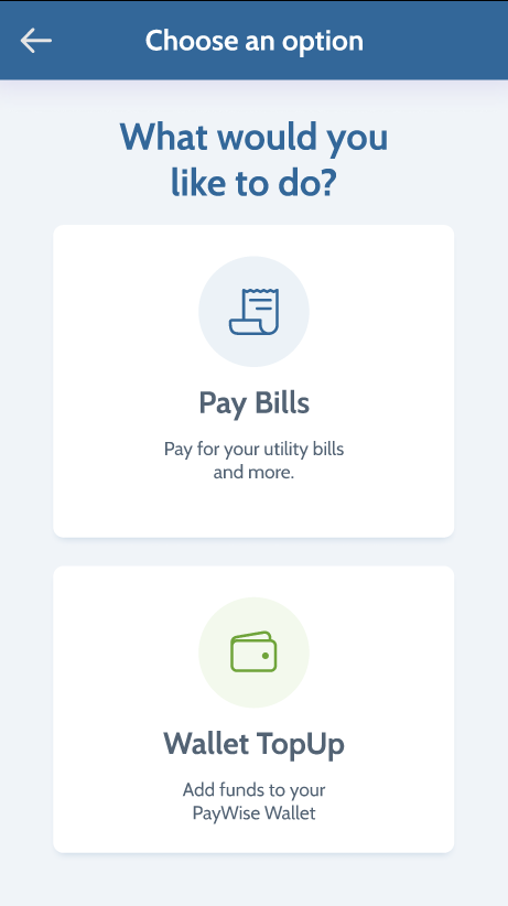
Same issue as 01, shown on a second screen. The two option cards and their copy are identical in both versions — only how much of the screen they're allowed to use is different.
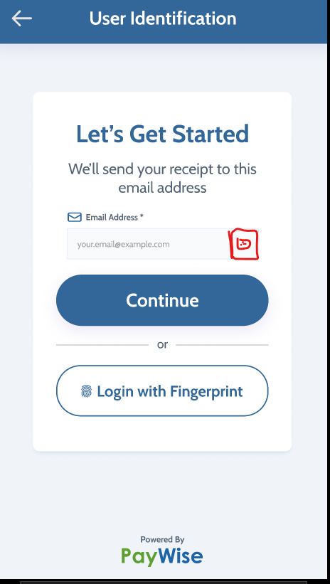
Email step is missing its keyboard-trigger icon
The design puts a small icon inside the email field whose job is to open the keyboard on demand. It isn't in the current build — which is also why the system keyboard ends up parked on screen permanently instead (see 04).
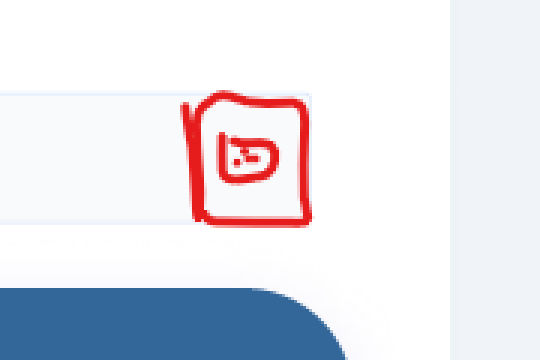
This icon, zoomed in
It's circled directly in the Figma file next to the email field. Tapping it should bring up the keyboard; the keyboard should otherwise stay closed until a field that needs text input is focused.
Keyboard shows up with nothing to type
This is the kiosk's very first screen — before a customer has touched anything, there's no text field on it at all. The system keyboard is already open, taking up the bottom 11% of the display.
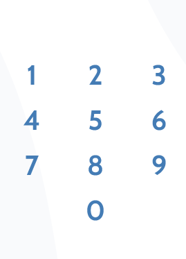
For numeric entry specifically, Pablo also likes the larger, borderless digit style used in the PayWise app's PIN screen (shown here) over small bordered keys — worth a conversation if you're already touching this flow, but not a required fix.
PayWise logo needs room above the keyboard
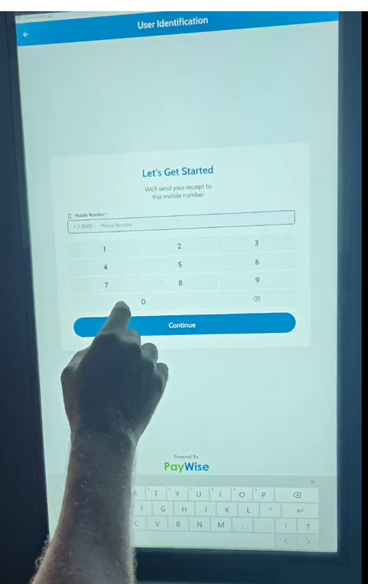
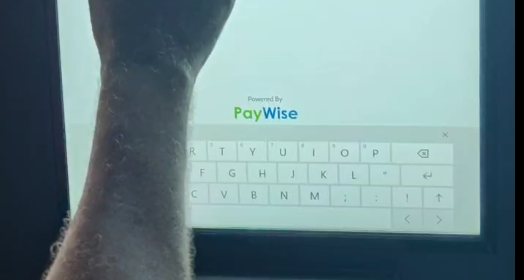
On screens like phone-number entry, the "Powered by PayWise" mark sits right against the top edge of the open keyboard. Give it roughly 1cm of clear space above the keyboard — enough that it reads as its own element, not as part of the keyboard.
Add a ring around the map pointer
Separate from the five items above — on the agent-locator map (not part of the walkthrough captured here), the pin marking a wallet top-up agent needs a ring around it so it reads clearly against the map. Flagging it here so it doesn't get lost in a different thread.